Can I Print in Pantone Colors? A Guide to Spot Colors in Large Format Printing
Pantone color accuracy in large format printing requires a different approach than offset. Learn how large format printers handle Pantone colors, what to expect, and how to get the best color results.
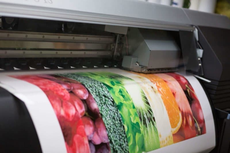
Pantone Colors and Large Format Printing
Large format printing uses wide-format inkjet technology, not offset lithography — which means it does not use dedicated Pantone spot color inks. Instead, large format printers create all colors from a combination of inkjet channels, typically CMYK plus Light Cyan, Light Magenta, and in extended gamut systems, Orange, Green, and Violet. This expanded ink set allows modern large format printers to reproduce a significantly wider range of colors than standard CMYK, but it does not replicate true offset Pantone inks.
The practical question for most large format clients is: how close can we get, and is it close enough for your application?
How VSL Print Handles Pantone Color in Large Format
Our large format presses are profiled and calibrated to Pantone standards using a spectrophotometer-based workflow. When you specify a Pantone color, we reference its Lab color values (a device-independent color specification) and profile our press output to match. For most Pantone colors, we can achieve a Delta-E difference of 2–4, which is generally imperceptible under normal viewing conditions.
We use substrate-specific ICC profiles for each material we print on — matte vinyl, gloss vinyl, fabric, foam board, and others — because the same inkjet ink looks different on different surfaces. A profile built for gloss vinyl would produce incorrect color on matte vinyl or fabric.
Which Pantone Colors Are Easy to Match vs. Difficult
The large format inkjet gamut is broad but not unlimited. Colors that fall within it reproduce accurately:
- Most blues (Pantone 286, 300, 661) reproduce well in large format
- Neutral tones, warm grays, and earth colors translate accurately
- Mid-range greens and teals are generally within gamut
Colors that are difficult or impossible to accurately match include:
- Highly saturated oranges and reds (Pantone 021, 032, 485) — these often shift slightly even with careful profiling
- Vivid purples (Pantone Violet, 2725) — may appear slightly red-shifted on standard CMYK setups, better on extended gamut presses
- Metallic Pantones — these are completely outside any inkjet's capability; metallic effects in large format are achieved through metallic vinyl substrates, not ink
- Fluorescent Pantones — special UV-reactive inks are available on some large format presses but are not standard
Practical Tips for Pantone Color in Large Format Files
- Keep Pantone swatches named and active in your file — do not convert to CMYK yourself in your design application. Let our RIP apply the optimized conversion using our press profiles.
- Request a color proof for brand-sensitive applications. A proof on your specified substrate is the only way to verify color before a full production run.
- Provide a physical Pantone chip when color accuracy is critical. Our team can spectrophotometrically compare the chip to a test print and adjust the profile before production.
- Consider the substrate — the same print will look lighter on matte material than on gloss. If your brand color must be consistent, specify the substrate carefully and proof on it.
How Substrate Choice Shapes Pantone Results
In large format, the material is part of the color equation as much as the ink. Gloss vinyl reflects light from a smooth surface and produces the most saturated, vivid rendition of a Pantone target; matte vinyl scatters light and reads softer and slightly lighter; fabric introduces texture and a degree of light absorption that mutes saturation further; and an off-white or warm-toned substrate shifts every color printed on it. A brand red that hits its target on gloss vinyl may look noticeably flatter on matte fabric using the identical file. This is why we build and maintain a separate ICC profile for each substrate, and why we ask you to specify the exact material before we commit to a color expectation. Choosing between stocks is a subject of its own, one we cover fully in our primer on printing on paper and plastic.
Why a Spectrophotometer Beats Eyeballing
Color judged by eye is unreliable — it changes with lighting, with the colors surrounding a sample, and from one person to the next. A spectrophotometer removes that subjectivity by measuring a color's actual Lab values and reporting the Delta-E difference between your Pantone target and our test print as a hard number. A Delta-E around 2 to 3 typically reads as a match in normal viewing; higher numbers tell us the profile needs adjustment before the run. When color accuracy genuinely matters, this measured workflow is what separates a dependable match from a hopeful one.
Frequently Asked Questions
Can large format ever print a true metallic Pantone? Not with ink — inkjet cannot reproduce metallic reflectivity. The effect is achieved by printing on a metallic vinyl substrate or applying a specialty metallic film, not by mixing a metallic ink.
How close will my brand color get on a banner? For most Pantone colors within the press gamut, we target a Delta-E of about 2 to 4, which generally reads as a match. Highly saturated oranges, reds, and purples are the hardest and may shift slightly.
Should I convert Pantone to CMYK before sending my file? No. Keep colors as named Pantone swatches so our RIP can apply its optimized, substrate-specific conversion, which beats a generic conversion done in your design software.
Extended-Gamut Inks and the Pantone Bridge
Many modern wide-format presses go beyond the four CMYK channels, adding Light Cyan, Light Magenta, and in extended-gamut systems Orange, Green, and Violet. These extra inks meaningfully widen the range of reproducible color, pulling many vivid Pantone targets — bright oranges, clean greens, rich purples — into accurate range that standard CMYK alone would miss. The Pantone Color Bridge guide, which shows each Pantone color alongside its closest process simulation, is a useful reference when you want to preview how a spot color is likely to translate before you ever submit a file. While extended gamut narrows the gap dramatically, it still cannot reach true metallics or fluorescents, which remain outside any inkjet's reach.
Keeping Color Consistent Across a Sign Program
If your project is not a one-off but an ongoing program — a retail chain refreshing seasonal signage, a multi-location rollout — color consistency from run to run becomes the real challenge. The keys are standardization: specify the same substrate, the same press profile, and the same ink set for every piece, and keep a signed reference print on file. Mixing substrates or letting a program drift across different profiles is the fastest way to end up with banners that should match but visibly do not. We can lock a program to a defined profile and reference so each new batch lines up with the first. Property marketing runs on the same discipline — developers pair yard signs with real estate brochure printing and expect the brand color to match across both.
When Exact Pantone Matching Is Non-Negotiable
If your project requires true Pantone ink accuracy — for example, a large format piece that will hang directly next to offset-printed brand materials and must match exactly — we can discuss hybrid approaches or refer you to specialty large format solutions that use actual Pantone inks. These are less common and more expensive but may be appropriate for the most demanding brand applications.
Talk to VSL Print About Your Color Requirements
Color is one of the most important aspects of any print project, and we take it seriously. When you submit a large format request with Pantone specifications, our color specialists will review the colors against our press gamut and flag any that may require special attention. For brand-critical applications, we will recommend proofing before production. Call 646-843-0800 or request a quote online to discuss your specific color needs.
Looking for professional large format printing?
View Large Format PrintingReady to start your print project?
Get a free quote from a NYC commercial printer. Rush turnaround available.