Choosing the Best Paper for Offset Printing: Your Ultimate Guide
Paper selection shapes how your printed piece looks, feels, and communicates. With hundreds of options available, here's how to think through paper weight, coating, and finish for every type of offset print job.
Why Paper Selection Matters More Than Most People Think
Your paper choice shapes a printed piece in ways that go far beyond just the surface it's printed on. Paper weight determines how a piece feels when handled — whether it conveys substance and permanence or lightness and flexibility. Paper surface affects how colors reproduce — brilliant on a gloss coat, muted but sophisticated on uncoated. The right paper reinforces your message; the wrong paper undermines it, no matter how good the design or printing.
Understanding Paper Weight
Paper weight in the US is measured in pounds (lb), based on the weight of 500 sheets in a "parent" sheet size — but different paper categories use different parent sizes. This is why 60 lb text paper feels lighter than 60 lb cover paper. You need to know both the weight number and the category (text or cover).
Text Weights
- 50–60 lb text: Lightweight, economical — used for offset book printing, newsletters, newspapers
- 70 lb text: Middle-ground — common for mid-range brochures and marketing pieces
- 80 lb text: Most commonly specified offset text weight — good for brochures, catalogs, annual report interiors
- 100 lb text: Noticeably heavier — used for upscale brochures and catalogs where feel matters
Cover Weights
- 60–65 lb cover: Entry-level cover weight — workable but not particularly rigid
- 80 lb cover: Standard for most book and brochure covers, postcards, and mid-range business cards
- 100 lb cover: Noticeably rigid — used for premium business cards, hang tags, and covers where thickness conveys quality
- 120 lb cover and above: Very heavy — used for specialty business cards and packaging components
Understanding Paper Coating
Coating fundamentally changes how ink interacts with paper. Uncoated paper absorbs ink, which softens colors and gives a natural, textural feel. Coated paper restricts ink absorption, allowing it to sit on the surface and produce sharper, more vibrant results.
Coated Paper Finishes
- Gloss coated: High sheen, maximum color vibrancy, reflective surface. Best for photography-heavy work, product catalogs, and pieces where maximum visual impact is the goal.
- Silk / satin coated: Moderate sheen — good color reproduction with better readability than gloss. Popular for annual reports, corporate brochures, and books where text and images coexist.
- Matte coated: Very low sheen, sophisticated appearance. Excellent readability for text-heavy pieces. Colors are slightly less saturated than on gloss but the piece feels more premium. Can be written on with ballpoint pens.
Uncoated Papers
- Smooth uncoated: Standard writing paper texture. Excellent for text-heavy pieces, forms, letterheads, and pieces that will be written on.
- Laid: Traditional texture of parallel ridges. Formal, traditional appearance used for letterheads and certificates.
- Linen: Cross-hatched texture with premium tactile quality. Popular for business cards and stationery.
Specialty Papers
- Recycled and responsibly sourced papers: Available in most weights and coatings. Important for brands with sustainability commitments.
- Colored stocks: Pre-colored papers that incorporate the paper color as part of the design palette.
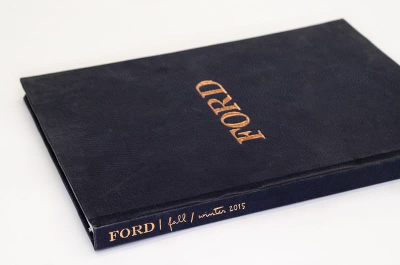
- Soft-touch coated papers: A tactile velvety coating that communicates luxury. Very popular for premium business cards and book covers.
- Pearlescent papers: Subtle iridescent sheen from mica content.
Matching Paper to Project
- Business cards: 100–120 lb cover, coated or uncoated depending on design
- Brochures: 80–100 lb text interior, 80–100 lb cover for covers
- Catalogs: 70–80 lb text interior on gloss or silk for image-heavy catalogs
- Annual reports: 80–100 lb silk or matte coated text interior; 100 lb cover
- Letterheads: 24 lb bond / 60 lb text, smooth uncoated
- Postcards: 10–14 pt coated card stock
- Flyers: 70–80 lb gloss or silk text for impactful pieces; 60 lb uncoated for economical handout flyers
Ask for Samples Before You Commit
No amount of reading about paper replaces holding it. Before finalizing paper selection for a significant project, ask your printer for samples. Feeling the weight, examining the surface, and seeing how ink looks on it will tell you more than any spec sheet. The same hands-on rule applies to oversized work, where our companion guide on materials for large format printing covers vinyls, fabrics, and rigid boards.
VSL Print maintains an extensive range of house stocks and can obtain samples from major paper merchants for review. We're happy to pull samples, show printed examples on specific stocks, and advise on paper selection based on your project goals and budget. Getting paper right is one of the highest-value decisions in a print project. You're also welcome to visit our NYC print shop and judge the stocks in hand before committing.
Brightness, Shade, and Opacity: The Overlooked Specs
Weight and coating get all the attention, but three other paper properties quietly shape the result. Brightness measures how much light a sheet reflects; a brighter paper makes colors pop and whites look crisp, while a softer, creamier white can feel warmer and more elegant for books and stationery. Shade refers to the paper's underlying tint — blue-white, neutral, or warm — which subtly shifts every color printed on it. Opacity determines how much printing on the reverse side shows through; it matters enormously for two-sided pieces and thin text papers, where low opacity causes distracting show-through. When you request samples, hold them to the light and print a test if you can — these properties are easy to overlook on a spec sheet but obvious in hand.
House Stock vs. Special Order
Printers keep a range of commonly used papers in inventory — the "house stocks." Choosing from them is usually cheaper and faster because there's no waiting on a merchant order and no minimum-quantity purchase to absorb. Special-order papers open up specific weights, colors, textures, and certifications, but they add cost and lead time, and some carry merchant minimums larger than your run. For most projects, asking "what do you already stock that fits this look?" yields a stock that's both economical and well understood by the press operators. Reserve special orders for when a distinctive paper is genuinely central to the piece's purpose.
Frequently Asked Questions
What weight should business cards be? Commonly 100–120 lb cover (roughly 12–16 pt). Heavier stocks feel more substantial; the right choice depends on the look you want and any finishing like foil or letterpress.
Coated or uncoated for a brochure? Coated (gloss or silk) for vivid, photo-heavy pieces; uncoated for a natural, tactile feel and easy readability of text. Many brochures pair a coated cover with a different interior.
Why does the same ink look different on two papers? Absorbency, brightness, and shade differ. Uncoated paper absorbs ink and mutes color; coated paper holds it on the surface for more saturation. Always proof color on or near your final stock.
How Paper Interacts With Finishing
Paper selection should anticipate what happens after printing. Heavier coated cover stocks can crack along a fold unless they're scored first, so any folded heavy stock needs a score in the plan. Soft-touch and certain matte coatings affect how laminates and foils adhere, so specialty finishes should be confirmed against the chosen surface. Highly textured uncoated papers can soften fine foil detail and reduce the crispness of small type. Even binding interacts with paper: very stiff stocks resist lying flat in a perfect-bound book, while very light text papers may show through if opacity is low. Choosing paper with the finishing operations in mind — rather than selecting a sheet first and discovering conflicts later — keeps the whole job coherent from press to bindery.
Letting the Paper Carry Part of the Message
Beyond mechanics, paper is a communication choice. A weighty, soft-touch cover signals premium care before a word is read; a warm, recycled uncoated stock signals authenticity and environmental values; a bright gloss sheet signals energy and visual impact. The most effective print buyers treat paper as part of the design brief rather than a late commodity decision, asking what impression the piece should make in the hand and selecting a stock that reinforces it. When budget is tight, concentrating the better paper where it's felt most — the cover, the business card, the invitation — often delivers more perceived quality than spreading a marginal upgrade across every page.
Looking for professional specialty printing?
View Specialty PrintingReady to start your print project?
Get a free quote from a NYC commercial printer. Rush turnaround available.